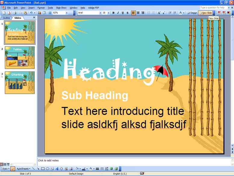
 PowerPoint … the tool we all love to hate.
Well, that might not be exactly fair. I mean, if I’m being completely honest then don’t I have to admit that the problem may lie with the user rather than the tool?
Maybe not in all cases, but I know that my own personal issue with most of the PowerPoint presentations I have had the displeasure of viewing is they are boring.
And not just kinda boring. I mean chin on the desk, prop your eyes open with a pencil, fall asleep sitting up snooze worthy!
Whose fault is this? Unfortunately not the program. It’s not PowerPoint’s fault how you use it. Nope, bad slides can only be blamed on one person. What to know who it is? Just look in the mirror. I can promise you that I’ll be standing right there beside you!

So today we are going to tackle this problem once and for all. Instead of just focusing on how to get the job done, now we are going to look at how to get the job done well. We want our slides to have style, to have a personality all their own as they tell the story we have in mind.
Why does this matter? Because we want our participants to be engaged, and spending our time reading through an endless list of random slides that all look the same is not the way to do this. We all know the wrong way, now let’s look at how to get things right.
Making a Good PowerPoint Slide (or for online presentations, a SlidePoint slide).
1. Have a Point
First off, don’t just make slides to make slides. Each slide should have a point, and it should add to the presentation as a whole rather than just take up space. In fact, this is a good time for me to point out one of my own personal pet peeves. Pre-set slide counts. If you sit down to build a new presentation already knowing the number of slides you will end up with, then something is very very wrong!
So instead of trying to stick to some arbitrary number you have picked out somewhere in your head, let the information speak for its self. You will end up with better slides and a more compelling overall presentation.
2. Tell a Story
Let your presentation build from one slide to another. What do I mean? Well I can promise that I don’t mean you need to sit down and copy over textbook high points into PowerPoint form. That’s lame.
I mean that you should present your information in a way that makes sense. Let one concept build on another and let each idea grow in front of your audience so that they can see it transform in front of them. In short, tell a story. Make it more than just facts, make it real. If you can to that, then I promise that you will create a lasting impact.
3. Mix Things Up
So now we’ve covered slide flow. We know how your presentation should progress and where you should look for your info. But what about the actual slides themselves? After all, that’s half, if not more of the story here.
The first thing to keep in mind is that you have to mix things up. Let me paint you a picture. How many PowerPoint presentations have you sat through that are comprised of nothing more than a seemingly endless parade of slides filled with white backgrounds and bullet pointed lists? I know that I’ve seen more than my fair share!
Not to be redundant but….boring!
With that in mind I’m going to suggest that we try something new. Instead of going for the black on white bullet point look (with a quote or two thrown in to mix things up!) let’s experiment. Try a different color background. Try presenting your information in different ways. Add in a chart. Add in two charts. Live on the edge!
Try anything as long as you are trying something. Why? Because you should be able to tell one slide from another without having to constantly check the number printed on the bottom.
 4. Use Your Space
My last point here is far from being the least important. In fact, I think it might actually be the true heart of the matter.
One of the best PowerPoint presentations I ever watched stands out not because of the quality of the information, but rather their use of space. I remember this presentation clearly, even though it has been 10 years since I watched it, because they used a nice pie chart in the upper right hand corner of each slide.
More than just a random clip art, this pie chart was relevant to the presentation and different portions were highlighted with each slide.
Now, why is this so unique? First off, the upper right hand corner is traditionally a dead area for PowerPoint slides. As most slides are set up with a left alignment, that is what our eyes are trained to look for. So much so that we stop reading the individual slide and start just responding to the pattern. When the pattern changes our focus sharpens.
Get the picture?
So not only do I want you to mix things up, but I also want you to make good use of your space. All of it. Maybe then you will build a presentation that someone will remember 10 years from now. I think that’s something to be proud of!
___
The Atrixware Weblearning LMS is a powerful, budget-friendly, easy-to-use Online E-Learning System for authoring, managing, and tracking online learning presentations, learning exercises and online quizzes. You can read the brochure, or to try it FREE, go to the Weblearning LMS Sign-up Form.